Introduction
On the 14th of December (2021), we organized another webinar with STRN, this time about Data Visualization in Sports with Jan Van Haaren & Koen Van den Eeckhout as our panelists. You can watch the recording of the webinar here (if you are logged in to your STRN profile). Jan & Koen shared a lot of interesting insights, so we decided to summarize these here as well in written form.
First of all, for those who didn’t yet know. Jan is currently working as a data scientist at Club Brugge, one of the best soccer clubs in Belgium. He has extensive experience with analytics in football, and is well up-to-date on the latest Artificial Intelligence methods, being a doctoral researcher in the past, and still connected to the team of Prof. Jesse Davis at KU Leuven as a research fellow.
Koen has founded his own design agency Baryon more than 7 years ago, after working as a doctoral researcher as well in Physics, and as a freelance consultant. Koen’s expertise is in conveying information clearly with the help of visuals.
In this article, we will first discuss the current state and then the future state of data visualization in sports as it was discussed during the webinar. In the end, we also share a few useful tools that you can rely on to create clear visuals for your data and the insights you have extracted from them.
Current state?
The first thing to note is that the amount of collected data over the last few years has (simply said) exploded. Consequently, data scientists are very high on the recruitment list by companies and other organizations in need of these types of analytical skills. Communicating the insights from this data, however, is the job of a data visualizer rather than a data scientist. Additionally, organizations usually expect UI designers & front-end developers to have the skills of a data visualization expert, whereas in reality, this is a whole different domain of expertise.

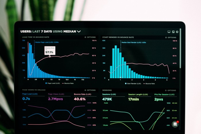
Secondly, because there is so much data available, dashboards are a very useful tool to visually represent the insights. There are, however, three typical problems with dashboards according to Koen:
-
They don't show the information you need in order to make a decision
-
They contain too much information you don't need (and sometimes bury the actually relevant information)
-
They are poorly designed and therefore create a lot of visual/mental 'noise' (alignment issues, confusing color schemes, bad typography)
Additionally, these dashboards can be personalized to individual users, but this requires a deep understanding of the different users and is not an easy task at all. As an example of this, Jan explained that many football coaches and football players were never trained to interpret charts and graphs. As a result, visualizations that are praised in the public space are often not very useful in practice.
Of course, (static) dashboards are not always the way to go. Since football practitioners have gotten used to printable PDF reports, the data is mostly visualized with static charts and figures, which are often poorly designed and therefore hard to read, whereas interactive charts and figures would be much more appropriate to convey the key message. For instance, an interactive chart or figure could initially be very basic, only providing the information that is strictly necessary to convey the key message in an intuitive manner, and allow the user to make the visualization more complicated by adding additional information.
Third, when it comes to researchers specifically, a lot of the research is just published and then not seen by anybody or only by other researchers within a niche (sub-)domain of the scientific community. Getting the insights to companies or other people can be difficult, but good visualizations can play a crucial role in this process. The guidelines for creating good visuals are largely the same for researchers as for companies, Koen explained: put yourself in the shoes of your audience, create visuals with minimal visual/mental noise, and maybe even more important: create a clear story with a key message and supporting arguments.
Koen has seen this evolving in the right direction over the past years, with researchers more and more taking control over their own communication efforts. This is mainly driven by (1) more role models, (2) more internal recognition by peers - albeit informal, and (3) more accessible learning resources.
Future state?

There are still many aspects that could be improved. According to both Koen & Jan, one of the most important ones is tailoring these visualizations to the end-user. Understanding when and what the user needs the information for is very important to decide which types of charts and data you should use best. To further improve this, insights could also be extracted from other domains where data is already visualized in a well-thought-through manner - think about domains like finance or even gaming.
A second important aspect is that organizations and clubs could consider hiring someone who is an expert in data visualization instead of expecting a data scientist to be able to be extremely good at this part as well. Of course, it all depends on resources and with this, the vision of the management. Besides new hires, another way to get this expertise in-house is through training programs. Plenty of clubs have a lot of interesting data, but even if this data is analyzed correctly, coaches and other practitioners will not work with it or understand what to do with it in case the insights are not communicated in a clear and accessible way. Bringing external data visualization and communication expertise into the organization with the objective to develop these skills in-house, improving all aspects of the data management process could therefore be very useful, for sure when applied within a more long-term strategy from the team’s strategy.
This leads to the final aspect, namely that clubs are often still very protective about the data they have collected and are (in many cases) unwilling to collaborate with external data visualization experts. This often leads to less-than-optimal visualizations that could easily be improved by being more transparent while still protecting the core IP.
Tools?

Finally, a few useful tools for creating interesting and clear visualizations were mentioned during the event:
-
Datawrapper: to create charts, maps, and tables
-
Flourish: to create beautiful data visualization through storytelling
-
Datavizcatalogue: a catalog of graphs and charts
-
Chartmaker: a directory with existing visualization solutions for different tools
-
Matplotlib: for visualization with Python
-
Seaborn: Python library for statistical data visualization
-
Plotly: Python library for data analytics and visualization tools
-
Bokeh: Python library for creating interactive visualizations for modern web browsers
-
D3.js: a library for visualization with JavaScript (especially useful for dashboards)
Now what?
As many of you already know, with the STRN, we hope to facilitate the creation, go-to-market, and implementation of trustworthy, evidence-based, effective sports technologies. Communicating your data in a clear, visual way is an important step for many different professionals (researchers, R&D managers, performance specialists, etc.) who are aiming to influence the decision-making of others (coaches, athletes, or other decision-makers,..).
In order to help people become more competent in the data visualization science & art, we’re organizing a Masterclass on the topic on the 20th of January (2022) with Koen Van den Eeckhout (Baryon). This will be a 3-hour (online) workshop during which we will dive into the question: how to visualize sports (research) data in the best possible manner? There is a maximum of 16 attendees (first come, first serve) to allow for interactivity. If you want to register for the event, you can do so here.


